Account Selection
Overview
The Account Selection (From Account) component provides a list of available accounts for the user to make a payment or transfer. The Account Selection component uses Data Aggregation and Keyword Search components as child components. Together, these components group the user accounts based on their types and provide the user option to search through the list.
The Account Selection component provides different flows based on the Customer ID.
- Single Customer ID: For a Single Customer ID, the accounts appear on the screen based on the account types (Savings and Current). Each account displays the nickname or the account name (Only if there is no nickname associated with the account), the last four digits of the account number, the available account balance, and the currency code.
- Multiple Customer ID: While using multiple customer IDs, the component first groups the account based on the customer IDs. Each account displays the nickname or the account name (Only if there is no nickname associated with the account), the last four digits of the account number, the available account balance, and the currency code.
The Account Selection component also provides the capability to restrict the user from viewing accounts based on the permissions
NOTE: The Account Selection component is used inside the Mobile Banking application.
Account Selection Contracts
The Account Selection component provides the contracts given below.
- Service Parameters
- Data Mapping
- Data Formatting
- Conditional Mapping Key
- Conditional Mapping
- Account Selection
- Data Aggregation
- Data Aggregation Extension
- Keyword Search
- onError Event
- onRowClick Event
- setContext Method
- appendDataInSegment Method
Service Parameters
The Service Parameters contract of the Account Selection component sets the service details required to configure the APIs that the component requires.
Here is a sample of the JSON object provided in the Service Parameter of the Account Selection component.
{
    "Accounts": {
        "ServiceType": "customVerb",
        "Service": "UserAccounts",
        "Object": "Accounts",
        "Verb": "getList",
        "Criteria": {}
    }
}
The Service Parameter contract provides the following key-value pairs for customization.
| Property | Description |
|---|---|
| ServiceType
Type: |
Defines the type of service to be performed. For example: |
|
Service Name: |
Name of the object service mentioned in the Quantum Fabric layer to fetch the data and metadata required for the component. For example: |
|
Object Type: |
Name of the object linked to the object service mentioned above in the Quantum Fabric layer to fetch the data required for the component. For example: |
|
Verb Type: |
Name of the operation or custom verb linked to the specified objects in the Quantum Fabric layer to fetch the data required for the component. For example: |
|
Criteria Type: |
The request payload as defined and configured in the Quantum Fabric Object service and operation. |
Data Mapping
The Data Mapping contract of the Account Selection component maps the widget IDs with the data to be displayed. The component retrieves the data for mapping from Context Data Object or Service response.
Here is a sample of the JSON object provided in the Data Mapping of the Account Selection component.
{
"AccountSelection": {
"SingleCustomer": {
"lblTitle": "${i18n{i18n.common.FromAccountTitle}}",
"segmentData": {
"segmentHeader": {
"lblAccountType": "${DataAggregationSegData.lblAccountType} + /s + ${i18n{i18n.common.accounts}} + /s + ( + ${ACC_COUNT} + )"
},
"segmentRow": {
"flxContent": {
"skin": "slFbox"
}
}
}
},
"MultipleCustomer": {
"lblTitle": "${i18n{i18n.common.FromAccountTitle}}",
"segmentData": {
"segmentHeader": {
"lblAccountType": "${DataAggregationSegData.groupTitle} + /s + ( + ${ACC_COUNT} + )"
},
"segmentRow": {
"flxContent": {
"skin": "slFbox"
}
}
}
}
},
"DataAggregation": {
"segList": {
"segmentMasterData": "${Collection.Accounts}",
"segmentUI": {
"headerTemplate": {
"lblAccountType": "${segmentMasterData.accountType}",
"imgAccountTypeIcon": "${segmentMasterData.accountLogo}",
"lblChevronImg": "up_icon.png",
"flxImgChevron": "flxImgChevron",
"flxHeaderSeparator": "flxHeaderSeparator",
"flxTopHeader": "flxTopHeader",
"flxAccountType": "flxAccountType",
"flxBottomHeader": "flxBottomHeader",
"Membership_id": "${segmentMasterData.Membership_id}",
"MembershipName": "${segmentMasterData.MembershipName}"
},
"rowTemplate": {
"lblBank": "${segmentMasterData.bankName}",
"lblAvailableBalance": "${i18n{i18n.common.availableBalance}}",
"imgLogo": "${segmentMasterData.bankLogo}",
"truncatingLabel.lblOne": "${segmentMasterData.nickName}",
"truncatingLabel.lblTwo": "${segmentMasterData.accountID}",
"rtxAmount": "${segmentMasterData.formattedAvailableBalance}",
"lblAccountChip": "${segmentMasterData.accountType}",
"flxBankName": "flxBankName",
"flxAccountName": "flxAccountName",
"flxContainer": "flxContainer",
"flxContent": "flxContent",
"flxSeparator": "flxSeparator",
"flxCheckbox": "flxCheckbox",
"flxHeaderSeparator": "flxHeaderSeparator",
"flxBottomHeader": "flxBottomHeader",
"flxTopHeader": "flxTopHeader",
"lblCheckbox": ""
}
}
}
}
}
The Data Mapping contract is assigned a JSON object with the following key-value pairs.
| Key | Description |
|---|---|
| AccountSelection |
Maps the data for the AccountSelection component. This parameter accepts two keys,
The
|
| DataAggregation |
This section maps the data with the widgets for the DataAggregation component in a key-value format. This parameter accepts a JSON object with
|
Important Considerations
To map data with the widgets inside the segmentUI key, a developer must follow any of these formats.
- To map a plain string, provide the text in the String format. For example, to map an image with lblChevronImg Label, follow this format.
"lblChevronImg": "up_icon.png"
- To map an i18n value, provide the i18n key in a String format. In the following example, the lblAvailableBalance Label is mapped with the i18n key for availableBalance.
"lblAvailableBalance": "${i18n{i18n.accounts.availableBalance}}" - To map a context or a collection object, provide the value in a String format. In the following example, the lblAccountType Label is mapped to the Account Type data retrieved from the Context Data Object.
"lblAccountType": "${segmentMasterData.accountType}" - To map the FlexContainer widget with the template widget, provide the FlexContainer widget ID as a String format as a value. In the following example, the flxContent FlexContainer is mapped to the flxContent FlexContainer in the template.
"flxContent": "flxContent"
- While designing a new template, follow proper naming conventions for the widgets. For example, the name of a Label widget must start with lbl, the name of a RichText widget must start with rtx, and the name of a FlexContainer widget must start with flx.
Data Formatting
Data formatting property is used to add a new formatting type or override existing formatting type in the default format JSON.
{}
Conditional Mapping Key
The Conditional Mapping Key is used to define mapping based on a criterion. The property is used to specify the value on which the conditional data mapping check should happen.
""
Conditional Mapping
The Conditional Mapping property key is used to map a widget with a data from Collection Object or service response as per the Conditional Mapping key.
{}
Account Selection
The Account Selection group contains the following contracts.
- Account Types
- Hidden Widgets
- Grouping Icon Configuration
- Bank Icon Configuration
- Alternate Account Name
- Account Number Formatting
Account Types
This contract sets the types of accounts that appears in the drop-down list. If an empty array is assigned to this contract, the drop-down list displays all account types.
| Parameter | Value |
|---|---|
|
Syntax |
JSON object containing the following keys.
|
|
Programmatic Name |
|
|
Default Value |
{
    "responseKey": "accountType",
    "typesToFilter": [
        "Savings",
        "Checking"
    ]
}
|
|
Type |
JSON |
Hidden Widgets
This contract specifies the array of widgets that the is to be hidden in the row template for any type of transfer.
| Parameter | Value |
|---|---|
|
Syntax |
JSON object with the type of transfer as key and the array of hidden widgets as value. |
|
Programmatic Name |
|
|
Default Value |
{
    "SameBank": ["imgLogo", "lblBank"]
}
|
|
Type |
JSON |
Grouping Icon Configuration
This contract specifies the icons to be used for every section.
| Parameter | Value |
|---|---|
|
Syntax |
JSON object containing the following keys- value pairs.
|
|
Programmatic Name |
|
|
Default Value |
{
    "SingleCustomer": {
        "responseKey": "accountType",
        "widgetId": "imgAccountTypeIcon",
        "images": {
            "Checking": "checking_accounts.png",
            "Savings": "saving_accounts.png",
            "default": "saving_accounts.png"
        }
    },
    "MultipleCustomer": {
        "responseKey": "isBusinessAccount",
        "widgetId": "imgAccountTypeIcon",
        "images": {
            "false": "personal_account.png",
            "true": "monthly_business.png",
            "default": "personal_account.png"
        }
    }
}
|
|
Type |
JSON |
Bank Icon Configuration
This contract specifies the icons for every bank.
| Parameter | Value |
|---|---|
|
Syntax |
JSON object containing the following keys- value pairs.
|
|
Programmatic Name |
|
|
Default Value |
{
    "responseKey": "bankName",
    "targetSegmentKey": "bankLogo",
    "images": {
        "Chase Bank": "chase_bank.png",
        "Citi Bank": "citi_bank.png",
        "HDFC Bank": "hdfc_bank.png",
        "HSBC Bank": "hsbc.png"
    }
}
|
|
Type |
JSON |
Alternate Account Name
This contract specifies the alternate key that the application uses if the Nickname response is empty.
| Parameter | Value |
|---|---|
|
Syntax |
JSON object containing the following keys- value pairs.
|
|
Programmatic Name |
|
|
Default Value |
{
    "widgetId": "truncatingLabel.lblOne",
    "alternateResponseKey": "accountName"
}
|
|
Type |
JSON |
Account Number Formatting
This contract specifies the widgets and format to display the account name and account number.
| Parameter | Value |
|---|---|
|
Syntax |
JSON object containing the following keys- value pairs.
|
|
Syntax |
|
|
Default Value |
{
    "key2AddSeparator": "truncatingLabel.lblOne",
    "separator": "-",
    "key2Slice": "truncatingLabel.lblTwo",
    "data2SliceLength": -4
}
|
|
Type |
JSON |
Data Aggregation
Account Selection component contains the Data Aggregation component as a child component. This group contains the following contracts to configure the child component.
- Row Template Config
- Header Template Config
- Rounded Flex Config
- Header Visibility
- Title Icon Visibility
- Single Row Selection Key
- Selected Row Config
- Records Per Page
- Search Parameters
- Dynamic Formatting
Row Template Config
The Row Template contract sets the Segment row template for the drop-down lists in the component. If this contract does not have any value, the segment visibility is turned off.
A developer can set the value for this contract in two formats.
- String Format: The dynamic row template ID is provided in a String format. For example:
flxTempFromAccountSelection1, whereflxTempFromAccountSelection1is the row template ID. - JSON Format: This format supports inter-app access while using composite apps. In this format, the developer must provide both the Microapp Name and the template ID as a JSON object.
| Parameter | Value |
|---|---|
|
Syntax |
This parameters sets the row template ID as a String or a JSON object containing the following keys.
|
| Programmatic Name | daRowTemplateConfig
|
|
Default Value |
{
	"templateID": "flxTempFromAccountSelection1",
	"microAppName": "ResourcesMA"
}
|
|
Type |
String/JSON |
Header Template Config
The Header Template contract sets the section header template for the drop-down lists in the component. If this contract does not have any value, the segment appears without any header.
A developer can set the value for this contract in two formats.
- String Format: The dynamic row template ID is provided in a String format. For example:
flxTempDataAggregation1, whereflxTempDataAggregation1is the template ID. - JSON Format: This format supports inter-app access while using composite apps. In this format, the developer must provide both the Microapp Name and the template ID as a JSON object.
| Parameter | Value |
|---|---|
|
Syntax |
This parameter sets the row template ID as a String or a JSON object containing the following keys.
|
| Programmatic Name | daHeaderTemplateConfig
|
|
Default Value |
{
	"templateID": "flxTempDataAggregation1",
	"microAppName": "ResourcesMA"
}
|
|
Type |
String/JSON |
Rounded Flex Config
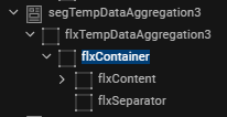
This contract is used to provide the rounded corners for the FlexContainer widgets inside the component.
| Parameter | Value |
|---|---|
|
Syntax |
JSON object containing the following keys.
To achieve the rounded corners of the FlexContainers, the widget structure of the header template must be as per the image below. |
| Programmatic Name | daRoundedFlx
|
|
Default Value |
{
    "SingleSelect": {
        "bottomRoundedFlxSkn": "flxWhiteMSShadowBottomHalf",
        "topRoundedFlxSkn": "flxWhiteMSShadowTopHalf",
        "fullRoundedSkn": "flxWhiteMShadow",
        "normalFlxSkn": "flxWhite"
    },
    "MultiSelect": {
        "bottomRoundedFlxSkn": "flxGrey100BottomHalf",
        "topRoundedFlxSkn": "flxWhiteMSShadowTopHalf",
        "fullRoundedSkn": "flxWhiteMShadow",
        "normalFlxSkn": "flxGrey100"
    },
    "rowTemplateWidgetId": "flxContainer",
    "seperatorWidgetId": "flxSeparator",
    "headerSeparatorWidgetId": "flxHeaderSeparator",
    "bottomHeaderWidgetId": "flxBottomHeader",
    "topHeaderWidgetId": "flxTopHeader"
}
|
|
Type |
JSON |
Header Visibility
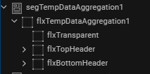
The header template structure must have a top header flex, bottom header flex and transparent flex. This contract configures the visibility of the Bottom header. The visibility configuration can be achieved in two ways.
- Enable or disable the visibility of bottom headers of all the sections. The sample code below shows how to disable the bottom header of all sections.
{ "visibility": false, "bottomHeaderWidgetId": "flxBottomHeader" } - Enable or disable the visibility of bottom header of the section with a single record. In this scenario, when the record visibility is disabled, the expand-collapse feature is hidden. This is the default behavior of the Data Aggregation component. The sample code below shows how to enable the bottom header of a single record.
{
	"visibility": true,
	"bottomHeaderWidgetId": "flxBottomHeader",
	"expColWidgetId": "flxImgChevron"
}
| Parameter | Value |
|---|---|
|
Syntax |
JSON object containing the following keys.
|
| Programmatic Name | daHeaderVisibility
|
|
Default Value |
{
	"visibility": true,
	"bottomHeaderWidgetId": "flxBottomHeader",
	"expColWidgetId": "flxImgChevron"
}
|
|
Type |
JSON |
Title Icon Visibility
This contract configures the visibility of the icon present in the header. If this contract does not contain any value, the header appears without any icon.
| Parameter | Value |
|---|---|
|
Syntax |
JSON object containing the following keys.
|
| Programmatic Name | daTitleIconConfig
|
|
Default Value |
{
	"visibility": true,
	"iconWidgetId": "imgAccountTypeIcon"
}
|
|
Type |
JSON |
Single Row Selection Key
Data Aggregation component provides the Component consumer to enable or disable the row selection. If the component consumer enables the row selection, the Single Row Selection Key contract configures how to display a user selected row.
| Parameter | Value |
|---|---|
|
Syntax |
A list is provided with the following values.
|
| Programmatic Name | daSingleRowSelectionKey
|
|
Default Value |
Skin |
|
Type |
List Selector |
Selected Row Config
This contract configures the UI for the selected row. The configuration of this property depends on the value in the Single Row Selection Key contract.
There are three manners to configure the Selected Row Config contract.
- Case 1: When the value of the Single Row Selection Key is
Skin, theselectedRowIndicatorkey contains the values of normal and Rounded Flex skin, and thedeselectedRowIndicatorkey contains a FlexContainer skin as value. - Case 2: When the value of the Single Row Selection Key is
Icon, theselectedRowIndicatoranddeselectedRowIndicatorkeys are assigned the UNICODE value of icons. - Case 3: When the value of the Single Row Selection Key is
Skin and Icon, the Selected Row Config contract is assigned two separate JSON objects withSkinandIconas keys.
| Parameter | Value |
|---|---|
|
Syntax |
JSON object with the following keys.
|
|
Programmatic Name |
daSelectedRowConfig
|
|
Default Value (Case 1): IfSkin is selected in the Single Row Selection Key list. |
{
	"widgetId": "flxContent",
	"selectedRowIndicator": {
		"normalFlx": "flxSecondary",
		"roundedFlx": "flxSecondarySelectedBottomHalf"
	},
	"deselectedRowIndicator": "slFbox"
}
|
|
Default Value (Case 2): IfIcon is selected in the Single Row Selection Key list. |
{
	"widgetId": "flxContent",
	"selectedRowIndicator": "\ue980”,
	"deselectedRowIndicator ": "\ue981 "
}
|
|
Default Value (Case 3): If |
{
	"Skin": {
		"widgetId": "flxContent",
		"selectedRowIndicator": {
			"normalFlx": "flxSecondary",
			"roundedFlx": "flxSecondarySelectedBottomHalf"
		},
		"deselectedRowIndicator": "slFbox"
	},
	"Icon": {
		"widgetId": "lblCheckbox",
		"selectedRowIndicator": "\ue980",
		"deselectedRowIndicator": "\ue981",
		"selectedSkin": "lblIconPrimary500FS30",
		"unSelectedSkin": "lblIconGrey400FS30"
	}
}
|
|
Type |
JSON |
Records Per Page
This contract configures the number of the records that appends the Segment widget to achieve lazy loading. When the component appears, the Segment widget contains the number of records set in this contract. When the user scrolls to the end of the screen, the Segment widget appends the next batch of records and so on.
To achieve lazy loading, the parent FlexContainer (in the component consumer) of the Data Aggregation component must have a fixed height and the layout type must beset as Flow Vertical.
When the value assigned to this contract is greater than zero, the component consumer must invoke the appendDataInSegment method at the onScrollEnd event of the FlexScrollContainer widget containing the component. If the value assigned to this contract is zero, all the records appear in the component.
| Parameter | Value |
|---|---|
|
Syntax |
The number of the records in a String format. |
| Programmatic Name | daRecordsPerPage
|
|
Default Value |
0 |
|
Type |
String |
Search Parameters
This contract configures the specific widgets that require the search functionality.
| Parameter | Value |
|---|---|
|
Syntax |
JSON object with |
| Programmatic Name | daSearchParams
|
|
Default Value |
{
	"Widgets": [
		"lblAccountType",
		"lblAccountName",
		"lblBank",
		"lblAvailableBalance",
		"rtxAmount"
	]
}
|
|
Type |
JSON |
Dynamic Formatting
This contract configures the format in which Amount of every account appears based on specific fields.
| Parameter | Value |
|---|---|
|
Syntax |
JSON object with |
| Programmatic Name | daDynamicFormatting
|
|
Default Value |
{
    "formattingField": {
        "AMOUNT_WITH_SUP": {
            "inputMapping": "${Collection.Accounts.availableBalance}",
            "outputMapping": "${Collection.Accounts.formattedAvailableBalance}",
            "formatDependency": "${Collection.Accounts.currencyCode}"
        }
    }
}
|
|
Type |
JSON |
Data Aggregation Extension
The Data Aggregation Extension group contains extra configurations that the developer can perform on the component. This group contains the following contracts.
Grouping Param
This contract specifies the specific criterion that groups the service response data.
| Parameter | Value |
|---|---|
|
Syntax |
JSON object with the following keys.
|
|
Programmatic Name |
daParamToGroup
|
|
Default Value |
{
    "SingleCustomer": "accountType",
    "MultipleCustomer": {
        "groupingKey": "Membership_id",
        "displayKey": "MembershipName"
    }
}
|
|
Type |
String/JSON |
Preferred Ordering
This contract helps the Component consumer to configure the order of the groups on the screen. The value provided in this contract depends on the value in the Grouping Param contract. For example, if the value in the Grouping Param is given as accountType, then the value of JSON can be Savings, Checkings, etc.
| Parameter | Value |
|---|---|
|
Syntax |
JSON object with the following keys.
|
|
Programmatic Name |
daPreferredOrder
|
|
Default Value |
{
    "SingleCustomer": {
        "Order": [
            "Checking",
            "Savings",
            "Deposits",
            "Mortage"
        ]
    },
    "MultipleCustomer": {
        "targetSegmentKey": "groupTitle",
        "Order": {
            "personal": "${i18n{i18n.common.personalAccount}}",
            "others": "${DataAggregationSegData.MembershipName}"
        }
    }
}
|
|
Type |
JSON |
Chip Indicator Config
This contract configures the visibility of the Chip Indicator. If this contract does not contain any value, then the chip indicator does not appear.
| Parameter | Value |
|---|---|
|
Syntax |
JSON object with
|
| Programmatic Name | daChipConfig
|
|
Default Value |
{
    "SingleCustomer": {
        "visibility": false,
        "widgetId": "lblAccountChip",
        "skinIndicator": "accountType",
        "Skin": {
            "Savings": "lblTag1Grey500FS10",
            "Checking": "lblTag2Grey500FS10"
        }
    },
    "MultipleCustomer": {
        "visibility": true,
        "widgetId": "lblAccountChip",
        "skinIndicator": "accountType",
        "Skin": {
            "Savings": "lblTag1Grey500FS10",
            "Checking": "lblTag2Grey500FS10"
        }
    }
}
|
|
Type |
JSON |
Keyword Search
Account Selection component uses the Keyword Search component as a child component. The Keyword Search group contains the given contract to customize this child component.
Data Mapping
The Data Mapping property of the Keyword Search component maps the widget IDs with the data to be displayed. The data is retrieved from Data Collection Object, Context variable, or Service response. The Data Mapping property of the Keyword Search component maps the i18n key and the text to be displayed as a String.
| Parameter | Value |
|---|---|
|
Syntax |
JSON object with the following keys.
|
|
Programmatic Name |
ksDataMapping
|
|
Default Value |
{
    "txtSearchBox": {
        "placeholder": "${i18n{i18n.common.searchText}}",
        "restrictChar": "#",
        "maxCharacters": "10",
        "rightPaddinginDP": "16",
        "skins": {
            "focus": "flxWhitePrimary500S",
            "regular": "flxWhiteGrey200S"
        }
    },
    "btnCancel": {
        "text": "Cancel"
    }
}
|
|
Type |
JSON |
onError Event
The OnError event handles any error that occurs during the user journey. The onError passes an error object to the parent widget containing the information about the error and where it had happened.
| Parameter | Value |
|---|---|
| Input parameter | JSON object |
|
Object Description |
The JSON object contains the following keys:
|
|
Sample Input |
var errordata = {
	"level": "ComponentViewController",
	"method": "methodName",
	"error": errorMsg
};
this.onError(errordata);
|
onRowClick Event
This event is triggered on the click of a row in the segment. This event passes the information of the selected row to the component consumer as an input parameter.
| Parameter | Value |
|---|---|
| Input parameter |
|
| Programmatic Name | onRowClick
|
|
Sample Code |
this.onRowClick(rowData); |
|
Return Type |
None |
setContext Method
This method is invoked inside the parent component or form controller. This method sets the data from the component consumer in the Account Selection component.
| Parameter | Value |
|---|---|
|
Syntax |
|
| Input parameter | JSON object containing the context variable. For more information on the context object, click here. |
|
Sample Input |
this.view.accountselection.setContext(contextData); |
|
Return Type |
None |
appendDataInSegment Method
This method is usually invoked at the scroll end of the container containing the Data Aggregation component. This method appends the next batch of records to the component.
| Parameter | Value |
|---|---|
|
Syntax |
|
| Input parameter |
NA |
|
Sample Input |
this.view.dataaggregation.appendDataInSegment(); |
|
Return Type |
None |
Context Object
The context object is a JSON object that is used to pass data from the component consumer to the Account Selection component. This data mainly consists of the various information for the user accounts with to the user selected transfer type.
Here is a sample of the Context JSON Object used inside the component.
var context = {
"entitlements": [],
"isAccountSelected": true,
"Account": {
"lblChevronImg": "up_icon.png",
"principalBalance": "21755.85",
"accountLogo": "checking_accounts.png",
"bankLogo": "chase_bank.png",
"accountName": "Laura's checking account",
"bankName": "Chase Bank",
"formattedAvailableBalance": "€ 21,607<sup>76</sup>",
"availableBalance": "21607.76",
"flxCheckbox": "flxCheckbox",
"accountID": "118656",
"flxHeaderSeparator": "flxHeaderSeparator",
"lblAccountChip": {
"isVisible": false
},
"accountType": "Checking",
"isBusinessAccount": "false",
"truncatingLabel.lblOne": "Laura's checking account-",
"flxTopHeader": "flxTopHeader",
"flxImgChevron": "flxImgChevron",
"flxAccountName": "flxAccountName",
"truncatingLabel.lblTwo": "8656",
"flxContent": {
"skin": "flxSecondary"
},
"flxContainer": "flxContainer",
"lblCheckbox": {
"text": "",
"skin": "lblIconPrimary500FS30"
},
"imgLogo": {
"isVisible": false
},
"rtxAmount": "€ 21,607<sup>76</sup>",
"transactionCurrency": "EUR",
"lblAvailableBalance": "Available Balance",
"flxAccountType": "flxAccountType",
"imgAccountTypeIcon": "checking_accounts.png",
"flxBottomHeader": "flxBottomHeader",
"lblBank": {
"isVisible": false
},
"lblAccountType": "Checking",
"flxBankName": "flxBankName",
"flxSeparator": "flxSeparator",
"sectionIndex": 0,
"rowIndex": 0
},
"transferType": "SameBank",
"isCombinedUser": false,
"primaryCustomerId": {
"id": "800343",
"type": "personal"
}
};
In this topic
